Color is critical component of art, and a key to creating beautiful batts. Today we have a primer on color theory, and in Part 2 we’ll be looking at some examples of batts and how they follow (and break!) these common rules.
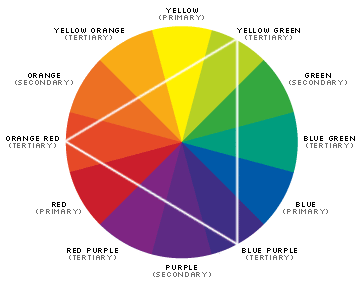
 Let’s start with the color wheel. The color wheel is comprised of three main colors, red, blue, and yellow. In traditional color theory primary colors are the 3 pigment colors that can not be mixed or formed by any combination of other colors. All other colors are derived from these 3 hues.
Secondary colors are created by combining the primary colors. Red+yellow=orange, yellow+blue=green, and blue+red=purple.
Tertiary colors are formed by mixing a primary and a secondary color: yellow-orange, red-orange, red-purple, blue-purple, blue-green & yellow-green. That’s why the hue is a two word name, such as blue-green, red-violet, and yellow-orange.
Traditional Color Combinations
Analogous colors are any three colors which are side by side on a 12 part color wheel, such as blue-green, green, and yellow-green. Usually one of these three colors predominates.
Complementary colors are any two colors which are directly opposite each other, such as red and green, or or yellow-green and red-purple.
Triadic color schemes use colors that are evenly spaced around the color wheel. In the color wheel above the example is orange-red, yellow-green, and blue-purple. When using a triadic color scheme it’s important to balance the colors thoughtfully.
The split-complementary color scheme is a variation on the complementary color scheme. In addition to the base colors, it uses two colors adjacent to its component, so instead of red and green, it would be red, yellow-green, and blue-green.
Nature provides many examples of beautiful color harmony, which is why so many artists continue to draw inspiration from nature. In our next post we’ll show you some examples of beautiful batts and how these rules have been applied (or ignored!).